Solo

Illustration by Nicholas Dewar
One of my favorites is the website for the Law Office of Joe Dane, a lawyer in Orange, Calif. There are many reasons, but the most compelling are the clean, contemporary design; effective use of white space; prominent placement of photographs; easy navigation bar and clearly relevant content; and very few pages.
Most eye-catching for me is the banner, which isn’t a banner in the traditional sense because it is undefined white space, so it is very easy on the eye. My eye goes where it is supposed to go in the proper order.
I see “Joe Dane” then it travels to his picture. (There’s Joe Dane!) Then it goes to his content, which is relevant to someone seeking a criminal defense attorney, nicely laid out without jumping out at me, nor do I have to dig for it.
The column of text is nice and wide, which is easier on the eyes. The navigation bar is just simple and user-friendly. The photo selection and rotation provides compelling imagery that conveys the types of criminal issues Dane deals with, but it’s not overwhelming. And most importantly for me when I look at a solo’s site, it is unique. Being a solo is about being different, so the website should not look like everyone else’s.

When I look at Dane’s website, it states simply yet powerfully through design, logo, use of white space, color choices, font size and content its purpose and message: “I’m Joe Dane, criminal defense lawyer. I’m the solution to your problem. Call me.”
Improvements or issues to consider?
1) I would have contact info on the blog portion of the site.
2) Since Dane is a criminal defense lawyer and not everyone has access to high-speed Internet, I wonder if the connection is slowed by the changing graphics. Does the potential client stay on the page and wait, or move on?
3) I would make the font size slightly larger for easier reading.
I also like the Startup Lawyer site for many of the same reasons that attract me to Dane’s site, but there are a few major drawbacks.
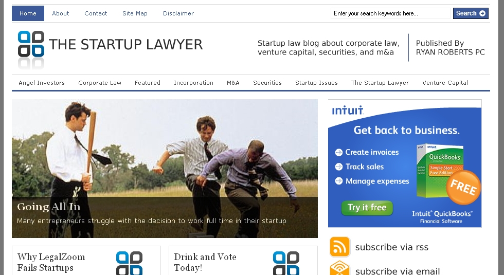
I think it is very inappropriate for a solo practitioner who is looking to attract business to utilize Google AdSense and other forms of paid advertising, drawing away potential clients from the site and its purpose—to get a potential client to pick up the phone. The money generated is peanuts, but the potential financial loss is great. If an attorney wants to garner advertising dollars, do so on a separate page indicating the attorney endorses these products if they are relevant to his or her clients.
Also, there is no photograph of the attorney, which would help with the “know, like, trust” factor. And, given the site is more high-tech in practice area and design, there should actually be a video introduction 30-60 seconds in length to compel picking up that phone.
See also:
Branding, Burkey Belser
Innovation, Tom Mighell
Virtuality, Richard Granat
All Business, Neil J. Squillante
Youth Appeal, Rex Gradeless
Susan Cartier Liebel is a legal career coach and consultant based in Northford, Conn. She is the creator of Solo Practice University and author of the blog Build a Solo Practice.