Visual law services are worth a thousand words--and big money
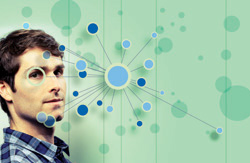
Daniel Lewis: “What we’re trying to do is make the process easier, more intuitive, more thorough.” Photo of Daniel Lewis by Tony Avelar, illustration by Stephen Webster.
Daniel Lewis was midway through his second year at Stanford Law School when he became convinced there was a better way to do legal research.
The thought came to him while doing work for a nonprofit in 2011. He was trying to understand where his issue fit within a broad group of cases his research had found. In his mind he pictured a view of his issue triangulated against the most important cases at the center and all the other, less important cases circled around them.
“It took shape in my mind as sort of a visual process of trying to figure out where on this map I needed to locate myself and what the other cases were that I needed to be aware of,” he recalls. As he discussed that idea with other students, he discovered many of them shared his approach of trying to contextualize their research visually.
With the rough contours forming in his mind of a better legal research mousetrap, Lewis took the idea to various people at Stanford, most influentially Jeffrey Heer, a computer science professor then at Stanford (and now at the University of Washington) and an expert in data visualization. Heer introduced Lewis to computer science research on understanding social connections and visualizing data sets that helped him begin to crystallize his idea.
By the beginning of his third year, Lewis had teamed up with friend and classmate Nicholas Reed. That fall the pair took a course in venture capital, and in the spring they enrolled in an intensive LaunchPad course in product design at Stanford’s Hasso Plattner Institute of Design, known as the D.school. Before year’s end they had a business plan, and just two weeks before graduation their plan placed second in a universitywide business plan competition.
By their June 16, 2012, graduation day, Lewis and Reed had investors knocking at their doors. A week after graduation they went full bore into raising funds; and a month later, just a few days before they were to take the bar exam, they closed an initial round of financing of $1.1 million.
Ravel, their legal research alternative, was born.
Ravel does not look like traditional legal research platforms. The difference is its visual presentation of search results. Rather than display a stack of text entries, Ravel draws a visual map of the results, showing the relationships among cases and their relative importance to each other—much like the triangulation Lewis originally imagined.
Daniel Lewis was midway through his second year at Stanford Law School when he became convinced there was a better way to do legal research.
The thought came to him while doing work for a nonprofit in 2011. He was trying to understand where his issue fit within a broad group of cases his research had found. In his mind he pictured a view of his issue triangulated against the most important cases at the center and all the other, less important cases circled around them.
Enter a search query and you get the standard list of matching cases displayed along the right side of your screen. But across the left three-quarters you see a cluster map showing the cases as circles of various sizes. The larger the circle, the more important the case; the most relevant cases appear in the center.
Lines radiate out of the circles, connecting each case to others it cites and that cite it. The thickness of the line indicates the depth of treatment. Hover your pointer over a case and its information shows in the right pane. Click it to get a list of every case cited within it. Double-click it to get the full text.
Below the cluster map is a timeline, with the cases arrayed across the map by date. To see only cases from a specific period, drag bars along the timeline to limit the view.
The visualizations, Lewis says, help researchers quickly understand the lay of the landscape for an issue—which cases are the major ones—and then better filter results to fit the research.
“What we’re trying to do is make the process easier, more intuitive, more thorough and give people greater confidence that they’re finding the cases that are best suited to their need.”
To date, Ravel remains in a beta-testing stage and is free to use. Fifteen large law firms are helping test the platform, with a particular focus on its role in sophisticated, complex litigation. Their feedback has been positive, Lewis says.
“Either we’re crazy,” he says, “or we’re on to something.”

Margaret Hagan: “I would love to see legal product designers embedded in law firms and in court systems.” Photo by Tony Avelar.
THE DISRUPTOR
Disruptive innovation is a concept popularized by Harvard Business School professor Clayton M. Christensen in his 1997 book, The Innovator’s Dilemma: When New Technologies Cause Great Firms to Fail. Citing the personal computer as the classic example, he described the phenomenon by which an innovation transforms a market by introducing simplicity and convenience where complexity was the rule.
Whether Ravel will prove to be a disruptive technology remains to be seen. It seems safe to say, however, that Lewis and his colleagues are almost certainly on to something. In fact they represent a trend, rapidly gaining momentum, in which visualization tools and design concepts are used to help lawyers, students, consumers and scholars make sense of the law.
As if through some scheme of cosmic synchronicity, the last year has seen visual law take a place at the leading edge of legal technology across a range of applications. It has been embraced by product vendors, app developers, legal academics and legal services organizations—all sharing in the belief that a picture is worth a thousand words when it comes to making the law more understandable and accessible.
“We are having a visual moment,” says Margaret Hagan, who in November launched the Program for Legal Technology & Design at Stanford’s D.school, together with Ron Dolin, a fellow at Stanford Law’s Center on the Legal Profession. The program will focus on using design to build better tools for bringing law to consumers and on promoting and documenting research in legal design.
Hagan also founded a personal project called the Open Law Lab, where she focuses on four law-and-design topics that sum up the current range of initiatives: legal design process, visual law, access to justice, and legal education and practice.
Her interest in visual law started in law school when she would sketch comiclike flowcharts to help make sense of legal concepts. As she shared them with classmates and heard them clamor for more, she realized she was on to something useful. After her Stanford Law graduation last year, Hagan went straight into a yearlong fellowship at the D.school.
Unlike Ravel, which uses visualization to make sense of data, Hagan’s focus is on design. Her strongest interest is in how elements of design can be employed to enhance access to justice and legal education.
“Design is the ‘how’ of the equation,” Hagan explains. “Law is very good at figuring out the what—what is the goal. But in terms of how to get at that goal, that is design. It is the art and science of how to make things usable.”
Among her projects, Hagan has created Law Dojo, a set of games for lawyers, law students and nonlawyers that combine comics and quizzes to teach lessons about law. The games are included in an app that works on Apple and Android tablets and mobile phones.
So passionate is she about legal design, Hagan envisions it becoming an entirely new career track within the profession. “I would love to see legal product designers embedded in law firms and in court systems—someone trained in design and engineering who knows best practices and can be an advocate for clients and users.”
THE EVOLUTION
The genesis of visual law is difficult to trace. For use in U.S. legal research, Fastcase introduced one of the first such tools in 2008. Its Interactive Timeline displays search results as various-size bubbles along a visual timeline.
The inspiration for the timeline, Fastcase CEO Ed Walters says, was the work of two data-visualization pioneers: statistician and Yale professor emeritus Edward R. Tufte and Dr. Hans Rosling, a Swedish physician and statistician. Rosling’s 2006 presentation “The Best Stats You’ve Ever Seen,” visualizing global health data, consistently ranks among the most popular TED talks of all time.
A UK legal research company, Justis Publishing Ltd., first used data-visualization tools in the late 1980s or early 1990s for legal research products on CD-ROMs, according to Jonathan Daymond, its sales and marketing director. In February 2011, Justis launched a Web visualization tool, the JustCite Precedent Map, which uses nodes to illustrate the relationships between cases and to help users see which cases most closely relate to their queries.
“Our early tools were very one-dimensional in a three-dimensional way,” Daymond explains. “But they were the starting point; from there the concept emerged of exploring what we can do to allow you to see how your case connects with other cases across different jurisdictions.”
While these legal research applications have their foundation in data visualization, other forms of visual law were inspired by principles of design and typography. Today, the concept of visual law embraces a diverse range of projects intended to make the law more accessible to consumers, more intuitive for lawyers, and more transparent for academics. Consider some of the varieties of visual law:
• To help New York City’s 10,000 street vendors understand their legal rights and responsibilities, the Center for Urban Pedagogy created a pamphlet in 2009 that uses simple graphics and minimal text. CUP, whose focus is using design and art to improve civic engagement, has developed many similar projects that tackle issues like juvenile justice and zoning law.
• The Connecticut Network for Legal Aid adapted the fotonovela style of graphic storytelling popular in Spanish-speaking countries to develop a series of educational legal rights videos in 2013. Using photographs and dialog bubbles in a style similar to comic books, the videos teach about topics such as the Family and Medical Leave Act and the Individuals with Disabilities Education Act.
• To eliminate the guesswork from settlement negotiations, San Antonio, Texas, mediator Don Philbin developed Picture It Settled, a Web and mobile application that uses predictive analytics to dynamically project the course of negotiations and the likely time and amount of a settlement.
• Visual law is also making inroads in legal academia. In January, the University of Zurich hosted the first International Conference on Multisensory Law, devoted to exploring the extent to which visual phenomenon are beginning to challenge the “verbocentric paradigm” that dominates the study and practice of law. Seminars covered such topics as “Making the Meaning of Contracts Visible,” “Representing Legal Permissions with Pictograms and Ideograms” and “Picture Your Divorce.”
• At the University of Baltimore School of Law, assistant professor Colin Starger has launched a project aimed at visually mapping Supreme Court doctrine. His SCOTUS Mapping Project combines sophisticated software with principles of information design to chart the relationships among the court’s opinions, with the goal of enhancing teaching and scholarship about the court.
By plotting relationships among majority, concurring and dissenting opinions over spans of years, the software can help users visualize how different lines of opinions and court doctrines have evolved. “We’re all familiar with the expression ‘line of cases,’ ” Starger says. “I took that concept and made it literal. You can look at 100 years of precedent in a quick way.”
A former computer programmer, Starger was prompted to launch his mapping project by his desire to find a way to represent the influence of dissents in Supreme Court doctrine over time. So far he has created visual guides to Supreme Court doctrine in areas such as same-sex marriage, collection of DNA evidence, the Affordable Care Act, the exclusionary rule and the right to privacy.

As a mediator, Don Philbin wanted a way to eliminate the guesswork from settlement negotiations. He developed Picture It Settled, a Web and mobile app using predictive analytics. Photo by Josh Huskin.
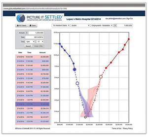
The site’s Settlement Prophet analyzes information from real cases and graphs it so you can map out your own settlement plan based on case type and jurisdiction.
CASES AS BUBBLES
Even with these varied applications of visual law, it is in the area of legal research that it could have its most direct impact on the day-to-day work of lawyers and law students. That is why Walters says Fastcase is focusing on bringing visualization tools to the front and center of its legal research platform.
Since introducing its Interactive Timeline in 2008, Fastcase has continued to refine it. Now the timeline shows not only when each case was decided but also how relevant each case is to the query and how important it is based on the number of citations.
The timeline represents each case as a gray bubble charted along a graph. Along the horizontal X-axis, cases are arranged by date. Along the vertical Y-axis, they are arranged higher or lower based on their relevance to your search. The size of the circle depicts how many times it has been cited overall, an indication of its importance. A smaller gold circle within each gray bubble shows how many times the case was cited for the search terms.
A user can switch from this relevance view to a court-level view, which changes the Y-axis to a list of court names and then displays the cases along the timeline grouped by court. Hover over a circle to get the case name and citation and a preview of its text.
Last August, Fastcase added a feature to the timeline called Explore Case Relationships. With this feature, when a user clicks on a specific case within the timeline, it generates a new timeline showing only the cases cited within that case and the cases that cite back to it.
Walters believes lawyers will someday look back at today’s text-based research platforms and realize how primitive they were. The problem, he says, is that text-based results lie. “The results all look the same; one result looks as good as another. The truth is there are some real winners there.”
Visual search lets you instantly perceive the winners among cases, Walters says. “Sometimes the right result jumps out of the pack and hangs above the others like a colossus. That’s the promise of visual search—that the best results jump out.”
A further advantage is that visual search is better at telling you when to stop searching. With text search, there is always the fear of the hidden winner—the big case that your relevance search missed because the judge used a different term, Walters says. But if you can see all the cases arrayed on a map, you can be more confident that you have covered the terrain.
“Text-based search results are necessarily one-dimensional: You can only sort based on one value. If you rank cases by relevance score, you might sort the most-cited case to the bottom. If you sort the most-cited case to the top, you might be sorting the most recent to the bottom. “We saw people sorting by relevance, then by most cited, then by date, and trying to keep that all in their heads. But our brains don’t work that way. One-dimensional search makes us do gymnastics in our head. Visual search is four-dimensional.”
Fastcase is preparing to release a new version of its platform that will give visual search even greater prominence. In the new version, the Interactive Timeline will appear on the same page as the search results rather than on a separate page. The results page will also display a tag cloud, showing the words and concepts that are most prominent in the cases within the search results.
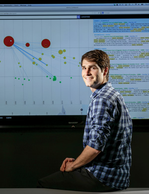
RAVEL VISUAL: Enter a search query and you get the standard list of matching cases on the right side of your screen. On the left side is a cluster map. Photo of Daniel Lewis by Tony Avelar.
MAPPING PRECEDENT
Whereas Ravel and Fastcase both show a range of cases over a timeline, JustCite’s Precedent Map charts the cartography of a single “focus” case. The Precedent Map display appears as an option in JustCite after a case is selected from the list of search results.
The map shows the focus case at the center of the screen, surrounded by nodes. Each node represents a case. Nodes to the left are previous cases cited by the focus case. Nodes to the right are subsequent cases that cite the focus case. The larger the node, the more connections it has to the focus case.
Between the nodes are color-coded connectors showing the type of citation: green for positive, amber for neutral and red for negative. Mouse over the arrow in the middle of a connector to see the details of the citation. Mouse over any node and the view changes to show the connectors between that node and the others.
“One of our attorneys likes to say: ‘Case law hunts in packs,’ ” Daymond jokes. “The nodes on the Precedent Map allow you to see whether there are other cases you should be aware of. This makes it easy to bring to the surface the two or three you need to see.”
The map has proved popular not only among lawyers, Daymond says, but also in law schools. Several law schools use it as a teaching aid to help illustrate what precedent is and how it works.
The growing use of touch-screen computers and tablets is likely to accelerate the development of visualization tools like Precedent Map, Daymond believes. “Finding different ways to navigate legal concepts visually is something we will continue to develop. In particular, with the move to touch screens, this becomes very natural.”
With these smaller legal re-search companies developing data visualization tools, can the big three—Westlaw, LexisNexis and Bloomberg Law—be far behind?
Well, maybe. The goliaths of legal research may be limited in their ability to present their data in visual forms. The limits result from the sheer vastness of their data and the structures of the systems in which they house it all.
BEYOND THE BIGGIES
Summit, N.J., lawyer and computer programmer John M. Miano worked for LexisNexis as a research scientist from 2011 to 2013. After leaving LexisNexis, and frustrated with what he sees as a lack of innovation in legal research systems, he began producing a series of videos outlining his vision of the legal research system of the future. One of Miano’s core criticisms of the established platforms is their collective failure to account for the visual aspect of communicating information.
“If you look at Moore’s Federal Practice in print, it will discuss a point of law, and then below that discussion you’ll see a formatted table displaying how each jurisdiction treats that point of law,” Miano explains. “Look at the same point online and all the graphical stuff is obliterated. As long as [the developers of these platforms] get this information up as text, that’s all they care about.”
One of his videos argues that in the future, text will be displayed with typeset quality, appearing much as it would in print. “I have to believe that if someone were to build a legal research system today and had never seen Lexis and Westlaw, that such a new system wouldn’t look like anything that’s on the market now.”
Westlaw and LexisNexis are hampered in developing visual tools by the structures and size of their databases and the constraints of their browser-based interfaces, Miano believes. While it is relatively simple for a small platform such as Ravel, with a limited library, to plot relationships among cases, it would be much more difficult to do for Westlaw or LexisNexis.
Marty Kilmer, vice president of product platforms at LexisNexis, says the challenge for a company such as his is to find a way to make visualizations practical and useful. It is an issue his company is actively researching, he says.
“Visualization is not an end point; it is a directional tool to help people get to where they need to be,” Kilmer says. “We struggle with developing the ability to display visualizations of large amounts of information in a way that makes them usable.”

Joseph Breda: “Data visualization is “baked into the DNA of” Bloomberg Law, though “we’re also careful not to lean on it for pure aesthetics.” Photo by Arnie Adler.
Although Lexis has not brought visualization tools to its case law research platform, it has developed several tools that are more focused. For example, its Shepard’s Graphical product works with its Shepard’s Citations Service to show a case’s citation history in either a visual map or grid format. In map view, Shepard’s Graphical displays the prior and subsequent appellate history of a case. In grid view, the product shows a breakdown of citation history either by jurisdiction or date.
Another LexisNexis product, the Verdict & Settlement Analyzer, uses dynamic charts and graphs to help lawyers navigate verdict and settlement data and zero in on the most relevant results. Search results are displayed using graphics that show a variety of information about cases, including types of case, verdict and settlement amounts, trends over time, and types of outcomes.
The Verdict & Settlement Analyzer and a similar product, the MedMal Navigator, are representative of how LexisNexis will use visualization tools at least for the near future. But at the same time, Kilmer says, visualization tools are not something customers are clamoring for.
“We have a very conservative market,” he says. “Sometimes we have to put things out there and help them understand how it can be useful.”
Thomson Reuters also has not incorporated visualization tools into case law research. However, in February it integrated its public records search tool, PeopleMap, into WestlawNext, and with that came new visualization features. PeopleMap draws out the connections about people, businesses and public records, providing an at-a-glance overview of a search subject’s networks and relationships.
People Map also brings address mapping to WestlawNext, using Google Maps. Once you find the person or business you are interested in, you can call up a map view without leaving WestlawNext. There you can see the address location and even use Google Streetview to get a picture of the address. This lets users see the kind of place someone lives in or the neighborhood in which a business is located, for example.
For the newest of the big three, Bloomberg Law, which launched in December 2009 out of the Bloomberg financial news network, data visualization is “baked into the DNA of the company,” says Joseph Breda, executive vice president of products for Bloomberg BNA. The classic Bloomberg terminal used graphs to help financial decision-makers quickly assess large quantities of numerical data.
In Bloomberg Law, visualizations are used selectively when they can help present information to the user. “But we’re also careful not to lean on it for pure aesthetics,” Breda says.
One example is Bloomberg’s Docket Analytics tool. Search for a company and you get a pie chart showing its litigation profile by types of cases. This lets you see at a glance that a company is engaged in a substantial percentage of asbestos litigation or securities matters. Another example is a tool that overlays news and events across a chart of a company’s stock performance. Click on any point along the chart—where a stock drops in value, for instance—to see news and events from that date.
FUTURE VIEW
Three years after first imagining a better legal research platform, Ravel’s Lewis believes lawyers need no help understanding the usefulness of his visual platform. Although visualization tools can walk a fine line between gimmick and glitter, he says Ravel has established itself firmly on the middle ground of useful and intuitive.
That is not to say that visuals will ever replace text-based research entirely. “The law is text-heavy, so there will always have to be an interplay between text and visuals,” Lewis says. “We’re trying to figure out the right balance for combining those elements.”
But he believes increasingly sophisticated visualization technology will enable Ravel to evolve from an exploratory tool to an explanatory one. Rather than simply allow users to explore the connections among cases, he explains, Ravel would help reveal the story or theme that connects them.
“We’re looking at how we can group cases in a way that tells the story. If you’re interested in the rules about abortion, let’s start with Roe v. Wade and then track the elements of that over time.
“We want to help build visualizations that function like dynamically created infographics to help people see the stories in their search results.”
Crazy or on to something? The answer, at least for visual law broadly, seems clear as day.
This article originally appeared in the May 2014 issue of the ABA Journal with this headline: “Vision Quest: Visual law services are worth a thousand words–and big money.”
Robert Ambrogi is a Rockport, Mass., lawyer and writer. He covers technology at his blog LawSites and co-hosts the legal affairs podcast Lawyer2Lawyer.